ShopDreamUp AI ArtDreamUp
Deviation Actions


Suggested Deviants


Suggested Collections


You Might Like…


Description
Image size
1800x2500px 1.13 MB
© 2005 - 2024 flameturret
Comments51
Join the community to add your comment. Already a deviant? Log In
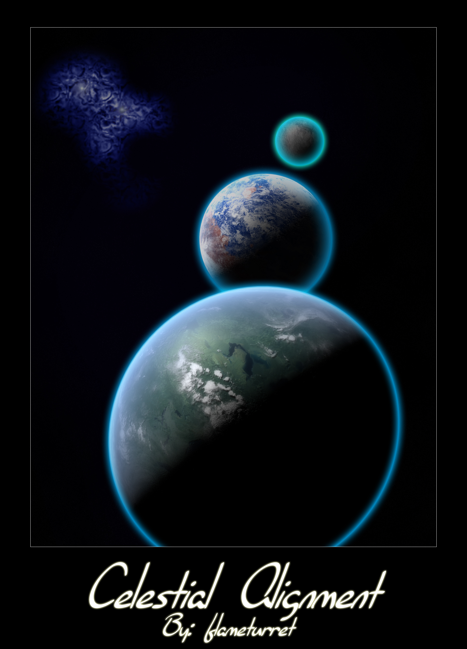
"By measuring the number and luminosity of observable galaxies in the known universe, astronomers put current estimates of the total stellar population at roughly seventy billion trillion."
- Maria Temming, How Many Stars Are There in the Universe?
Eustace: "In our world, a star is a huge ball of flaming gas."
Ramandu: "Even in your world, son, that is not what a star is, but only what it is made of."
- C. S. Lewis, The Voyage of the Dawn Treader, chapter XIV
"The sun? Conscious? How?" "In a way lower organisms like you have difficulty to grasp. One thought from the source takes longer than a human life. A conversation with other stars takes thousands of your years." "All the stars are conscious?" A dry laughter resounded. "Of course. They are the original inhabitants of the cosmos. Without them there would be no organic life, let alone organic consciousness."
- Elian Lazaro, Elysium
"The sun alone appears, by virtue of his dignity and power, suited for the duty of moving the planets, and worthy to become the home of God himself."
- Johannes Kepler, The Harmony of the World